
IvanHoe Logo
-
kingliveson
- Posts: 1388
- Joined: Thu Jun 10, 2010 1:22 am
- Real Name: Franklin Titus
- Location: 28°32'1"N 81°22'33"W
IvanHoe Logo
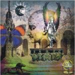
Can't decide which one...
- Attachments
-
- IvanHoe03.jpg (24.92 KiB) Viewed 3759 times
-
- IvanHoe01.jpg (23.76 KiB) Viewed 3759 times
PAWN : Knight >> Bishop >> Rook >>Queen
-
Dr.Wael Deeb

- Posts: 104
- Joined: Thu Jun 10, 2010 8:29 pm
- Real Name: Dr.Wael Deeb
Re: IvanHoe Logo
The first one of course 
Dr.D
Dr.D
-
kingliveson
- Posts: 1388
- Joined: Thu Jun 10, 2010 1:22 am
- Real Name: Franklin Titus
- Location: 28°32'1"N 81°22'33"W
Re: IvanHoe Logo
The first for its "red horse" symbolism is my preference, then one of my friends liked the second one.Dr.Wael Deeb wrote:The first one of course
Dr.D
PAWN : Knight >> Bishop >> Rook >>Queen
-
Dr.Wael Deeb
- Posts: 104
- Joined: Thu Jun 10, 2010 8:29 pm
- Real Name: Dr.Wael Deeb
Re: IvanHoe Logo
Nope,the first one is more furious....kingliveson wrote:The first for its "red horse" symbolism is my preference, then one of my friends liked the second one.Dr.Wael Deeb wrote:The first one of course
Dr.D
The second one is like a circus clown,a lot of unbalanced colours
Dr.D
-
kingliveson
- Posts: 1388
- Joined: Thu Jun 10, 2010 1:22 am
- Real Name: Franklin Titus
- Location: 28°32'1"N 81°22'33"W
Re: IvanHoe Logo
Those are Royal colours, and could you be more direct?!Dr.Wael Deeb wrote:Nope,the first one is more furious....kingliveson wrote:The first for its "red horse" symbolism is my preference, then one of my friends liked the second one.Dr.Wael Deeb wrote:The first one of course
Dr.D
The second one is like a circus clown,a lot of unbalanced colours
Dr.D
- Attachments
-
- IvanHoe04.jpg (25.7 KiB) Viewed 3711 times
PAWN : Knight >> Bishop >> Rook >>Queen
-
kingliveson
- Posts: 1388
- Joined: Thu Jun 10, 2010 1:22 am
- Real Name: Franklin Titus
- Location: 28°32'1"N 81°22'33"W
Re: IvanHoe Logo
Trying to decided which shade looks more doom and gloomy to be included in next IvanHoe build.

PAWN : Knight >> Bishop >> Rook >>Queen
Re: IvanHoe Logo
I like number 2. Cool colors.kingliveson wrote:Can't decide which one...
Best,
Gerold.
Re: IvanHoe Logo
How about:


Peter
Peter

Re: IvanHoe Logo
middle or top leftkingliveson wrote:Trying to decided which shade looks more doom and gloomy to be included in next IvanHoe build.